BRAND ATTRIBUTES
VALUES
Pioneering
Competitive
Agile
PERSONALITY
Sophisticated
Reliable
Purposeful
ESSENCE
Innovative
Accessible
Committed
ETHOS
Expertise
Creative
Value Added
COLORS
Dependable
Trendy
Modern
FONTS
Edgy
Clean
Chic
LOOK AND FEEL
Uncluttered
Welcoming
Refined
MOOD AND STYLE
Aesthetic
Meaningful
Impactful
LOGO & MARK DETAILS
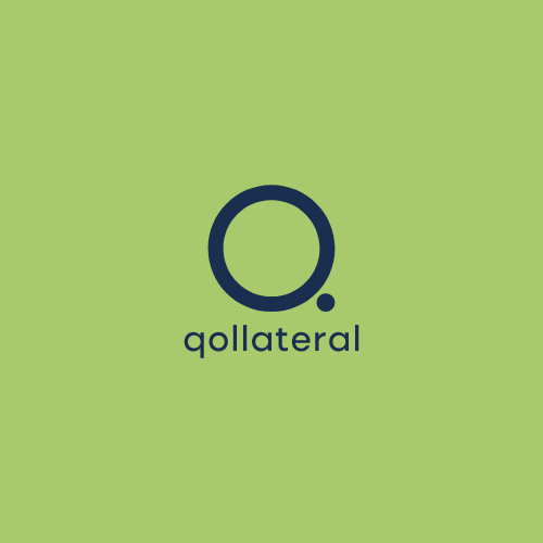
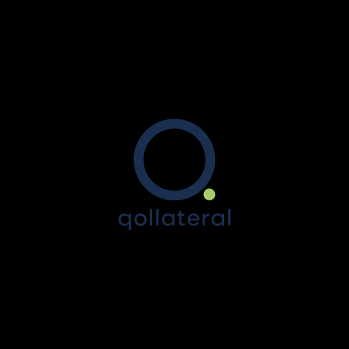
PRIMARY LOGO
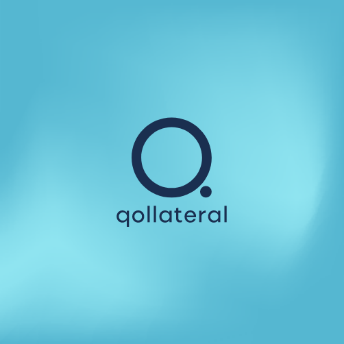
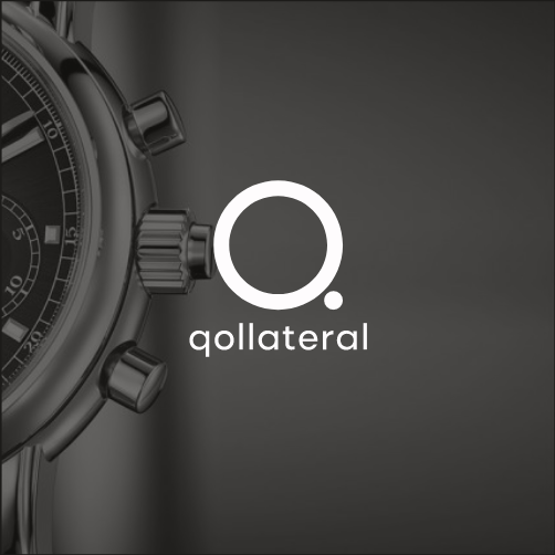
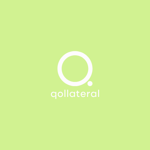
MONOCHROMATIC LIGHT LOGO (PRIMARY LOGO IN REVERSE)
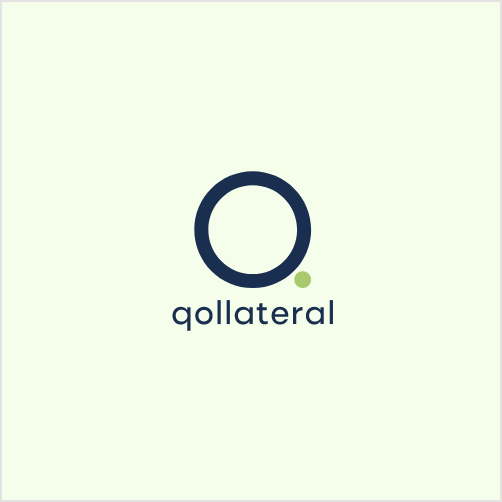
MONOCHROMATIC DARK LOGO (PRIMARY LOGO IN REVERSE)
ISOLATED ICON
ALL LOGOS
(Primary & Monochromatic Reverse Logos)
This icon can be used on social media profile pictures and places where a short logo or a responsive logo is needed.
PRIMARY ICON
MONOCHROMATIC LIGHT ICON (PRIMARY ICON IN REVERSE)
MONOCHROMATIC DARK ICON (PRIMARY ICON IN REVERSE)
LOGO SPACING
ALL LOGOS
(Primary & Monochromatic Reverse Logos)
Margin/spacing around the logo should be equal to 1/2 height of the logo icon (2X).
ISOLATED ICON SPACING
ALL LOGOS
(Primary & Monochromatic Reverse Logos)

Margin/spacing around the logo icon should be equal to 1/4th height of the logo icon (4X).
BEST PRACTICES
LOGO DO'S & DON'TS
APPLIES TO ALL LOGOS
(Primary and Monochromatic Reverse Logos)
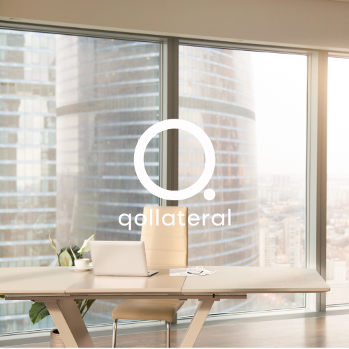
The following examples demonstrate how legibility and recognition of the logo is improved when placed on a recommended choice of background.


DO'S
Always use the Primary Logo where applicable.
When the Primary Logo usage is not possible, the Monochromatic Light Logo should be used on dark colored backgrounds and the Monochromatic Dark Logo on light colored backgrounds.
LOGO DO'S & DON'TS
APPLIES TO ALL LOGOS
(Primary and Monochromatic Reverse Logos)
The following examples demonstrate how legibility and recognition of the logo are compromised when placed on the incorrect choice of background.


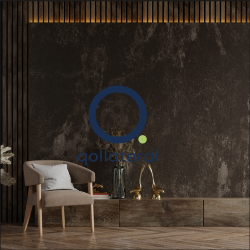
DON'TS
Do not use the Primary Logo and Monochromatic Dark Logo on dark colored backgrounds or dark photographic backgrounds.
Do not use the Monochromatic Light Logo on light colored backgrounds or light photographic backgrounds.
GENERAL LOGO BEST PRACTICES
LOGO SIZING AND ASPECT RATIO
Always maintain the aspect ratio when stretching/shrinking the logo.
LOGO PLACEMENT
Do not move the placement of the words and icon.


LOGO COLORS
Do not change the logo to any color other than the specified colors.
LOGO MARGINS
Always maintain the margins/exclusion zones around the logo.
TYPOGRAPHY
The two fonts selected are Clean, Refined and Elegant placing emphasis on the brand traits. In order to maintain consistency, all online and offline marketing collateral should utilize these fonts to represent the uniqueness of the brand.
TITLE & PARAGRAPH FONTS
Headings : Izmir Bold
abcdefghijklmnopqrstuvwxyzABCDEFGHIKLMNOPQRSTVXYZ
0123456789!@#$%^&*(_+)
60px
Primary h1
40px
Primary h2
30px
Primary h3
25px
Primary h4
20px
Primary h5
16px
Primary h6
Paragraphs & Body : Avenir Next
16px
Lorem ipsum dolor sit amet, consectetuer adipiscing elit, sed diam nonummy nibh euismod tincidunt ut laoreet dolore magna aliquam erat volutpat. Ut wisi enim ad minim veniam, quis nostrud exerci tation ullamcorper suscipit lobortis nisl ut aliquip ex ea commodo consequat. Duis autem vel eum iriure dolor in hendrerit in vulputate velit esse molestie consequat, vel illum dolore eu feugiat nulla facilisis at vero eros et accumsan et iusto odio dignissim qui blandit praesent luptatum zzril delenit augue duis dolore te feugait nulla facilisi. Lorem ipsum dolor sit amet, cons ectetuer adipiscing elit, sed diam nonummy nibh euismod tincidunt ut laoreet dolore magna aliquam erat volutpat. Ut wisi enim ad minim veniam, quis nostrud exerci tation ullamcorper suscipit lobortis nisl ut aliquip ex ea commodo consequat. Lorem ipsum dolor sit amet, consectetuer adipiscing elit, sed diam nonummy nibh euismod tincidunt ut laoreet dolore magna aliquam erat volutpat. Ut wisi enim ad minim veniam, quis nostrud exerci tation ullamcorper suscipit lobortis nisl ut aliquip ex ea commodo consequat.
COLOR SPECIFICATIONS
Color is an integral part of the brand identity. Accurate use of the color palette will not only reinforce the cohesiveness, but also serves a psychological purpose by communicating feelings to audiences.
The brand colors are a representation of brand traits: Modern, Inviting and Optimistic.


The Oxford Blue brings out the brand's trustworthiness and adds a sense of sophistication. The Yellow Green emphasizes the brand's calm, approachable side. While the Honeydew, signifies the confidentiality and transparency of the brand.
123
123
123
123
123
123